
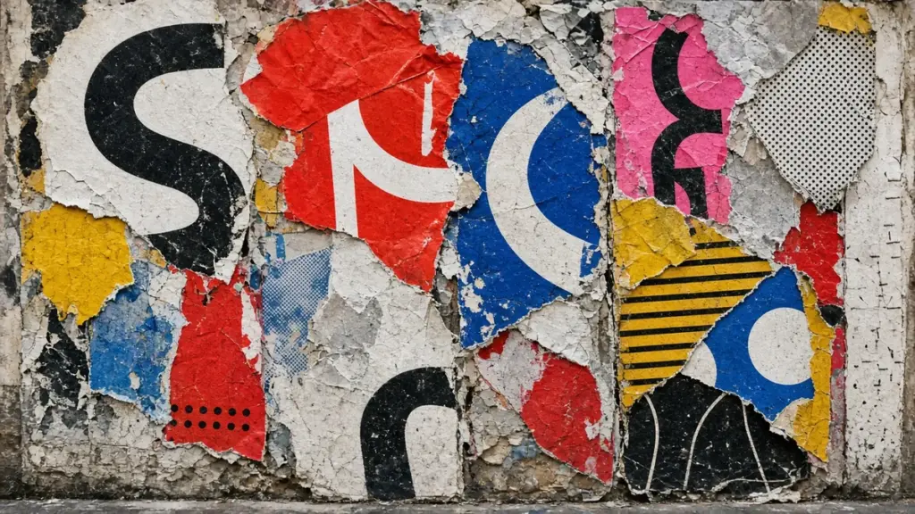
My memo:
“Is a design that messes up every rule of design still design?”
I’m asking this as a viewer. Somebody who looks at things, buys things, walks past things.
But viewers get a vote too. We’re the ones who have to look at it.
What is anti-design?
Short answer: anti-design is design that breaks the usual rules on purpose. The name goes back to an Italian movement of the mid-1960s, with groups like Archizoom and Superstudio, that pushed back against consumer culture and the comfortable deal between industry and design. By 2017, “antidesign” was also a web design term for sites made to look deliberately ugly or disorienting. My take as a viewer: when the rule-breaking is a deliberate choice, it’s still design.
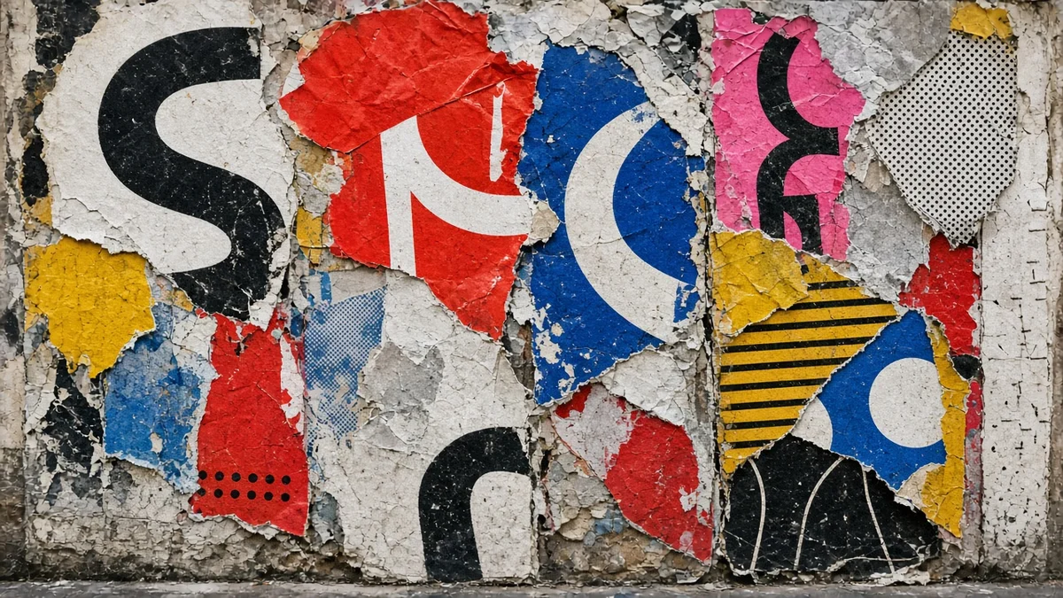
The rules, as a regular person sees them
Even if you never studied design, you know some of the rules. You just know them as feelings.
Text should be readable. Things should line up. Colors shouldn’t fight.
When a menu breaks those rules, you can’t find the soup. When a sign breaks them, you miss your exit.
So design, from the outside, looks like a set of rules that keep life from being annoying.
Then there’s the stuff that breaks every one of them on purpose.
What are famous examples of anti-design?
Exhibit A: Ray Gun’s unreadable interview (1994)
In 1992, a music magazine called Ray Gun started in Santa Monica. Its founding art director was David Carson, and its look became famous as “grunge typography.” Words overlapping. Columns crashing into each other. Text running off the page.
The most famous story: Ray Gun once ran an interview with the musician Bryan Ferry set entirely in Zapf Dingbats. That’s a symbol font. Little stars, arrows, scissors. No letters.
So you could not read that spread. At all. AIGA’s Eye on Design dates the spread to 1994 and passes on the backstory: “the story goes that Carson read the interview, deemed it boring, and so rendered it unreadable.”
Is that design? It’s a choice about type, made by a professional, for a reason. The reason just wasn’t “so you can read it.”
Exhibit B: Memphis furniture that broke good taste (1980s)
Go back a little further. On December 11, 1980, in Milan, Ettore Sottsass invited a group of designers and architects to his living room to talk about new forms of expression. That night became the start of a group called Memphis. The group showed its first 55 pieces in Milan in September 1981.
Memphis made furniture and objects in loud colors and patterns. Shapes that looked like toys. Bookshelves that looked like they were dancing.
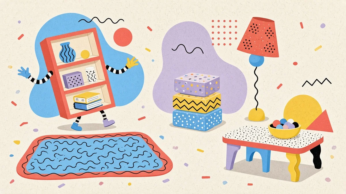
Memphis Milano’s official history page describes it as working “against the aesthetics, materials and production modes of industrial design.” It also says Memphis set out “to break down the taboos of good taste.”
So that’s the official goal. Break good taste. On purpose. With a laminate.
Exhibit C: the Brat album cover (2024)
Now something recent. In 2024, Charli XCX released an album called Brat. The cover is a flat, bright green square with the word “brat” in stretched, blurry, lowercase letters.
Wallpaper* magazine quotes The New York Times describing it as “four blurry letters centered in a puke-green square.” Wallpaper* also says the typeface is stretched Arial, blurred on purpose. It quotes Brent David Freaney of the studio Special Offer, Inc., who designed the cover with Charli XCX, telling The New York Times the blur came from designing it at “100 pixels by 100 pixels” and blowing it up.
By most traditional rules, that cover breaks things. The color is loud. The type is plain and fuzzy. There’s no image.
And yet. That green became a whole summer. “Brat” was named Collins Dictionary’s word of the year for 2024, defined as someone with a “confident, independent and hedonistic attitude.”
An album cover that looked like a mistake helped make “brat” the dictionary’s word of the year. That’s a pretty good return on four letters.
Here are the three side by side:
| Example | Year | Who | What it broke |
|---|---|---|---|
| Ray Gun, Bryan Ferry interview set in Zapf Dingbats | 1994 | David Carson, founding art director of Ray Gun | Readability: the interview was set in a symbol font |
| Memphis furniture and objects | First met Dec 1980, first show Sept 1981 (Milan) | Ettore Sottsass and the Memphis group | Good taste: loud colors, patterns, plastic laminate |
| Brat album cover | 2024 | Charli XCX with Brent David Freaney (Special Offer, Inc.) | Album cover habits: no photo, stretched blurry Arial, “puke-green” |
Is anti-design still design? A viewer’s answer
Here’s where I come down.
I think the rules of design exist for a reason. And anti-design only works because those rules exist. You can’t break a rule nobody knows. The Brat cover is funny partly because we all know what an album cover is “supposed” to look like.
So anti-design needs regular design. It leans on it. Like a teenager who needs parents to rebel against.
The other thing I notice: all three of these were very deliberate. Somebody chose the dingbats. Somebody picked that exact green, Pantone 3570 C according to Wallpaper*, and then blurred the type on purpose.
A mess by accident is just a mess. A mess with a reason is a decision.
And I think a decision about how something looks is still design. Even when the decision is “no.”
What I take from it as a viewer
Personally, I like classic, by-the-book good design. Clean. Readable. Everything lined up.
But here’s how I see it. Art is decided by the person who makes it. Design is decided by the people who look at it.
So if people love a messy design, it’s a good design. That’s the test.
And I like that anti-design asks a question. When something breaks the rules, I stop and look. Then I start noticing the rules everywhere else.
Normal design was also a choice. Anti-design is the thing that makes that visible.
FAQ
What is anti-design?
Design that breaks common rules on purpose, like readable type, neat alignment and calm color. The term first described a 1960s design movement in Italy.
Is anti-design still design?
Creative Bloq puts it this way: “Anti-design is still design, and there’s order and intention behind the apparent chaos.”
What font is on the Brat cover?
Arial, stretched and blurred on purpose, according to Wallpaper* and the designer, Brent David Freaney.
Why is the Memphis group called Memphis?
At the first meeting, a Bob Dylan record, “Stuck Inside of Mobile with the Memphis Blues Again,” was playing. The official site adds that Memphis is also Elvis Presley’s city in Tennessee and the capital of ancient Egypt.